Sweden Rock 2026
A new visual identity and design universe
Sweden Rock Festival is an institution in Swedish music culture. Every year, tens of thousands of visitors travel to Blekinge to experience some of the world’s greatest rock and metal acts. The festival keeps breaking attendance records and has become something of an icon – not just for its music, but for its community and the unmistakable aesthetic that has grown around it over the years.
When Sweden Rock reached out to us at Studio Konkret to create a completely new visual identity for the 2026 festival, we were both proud and excited. The brief was ambitious: to build a new visual expression – from the logo and key symbols to digital graphics, posters, and stage visuals. It was the kind of project that brought together everything we love: creative freedom, clear direction, and a client with both experience and intuition.
Production company: Studio Konkret
Client: Sweden Rock
Producer: Linus Rosenqvist
Art direction & animation: Olle Bergmark
3D animation: Viktor Jämterud
Sound design: Jakob Oldenburg
From first idea to new form
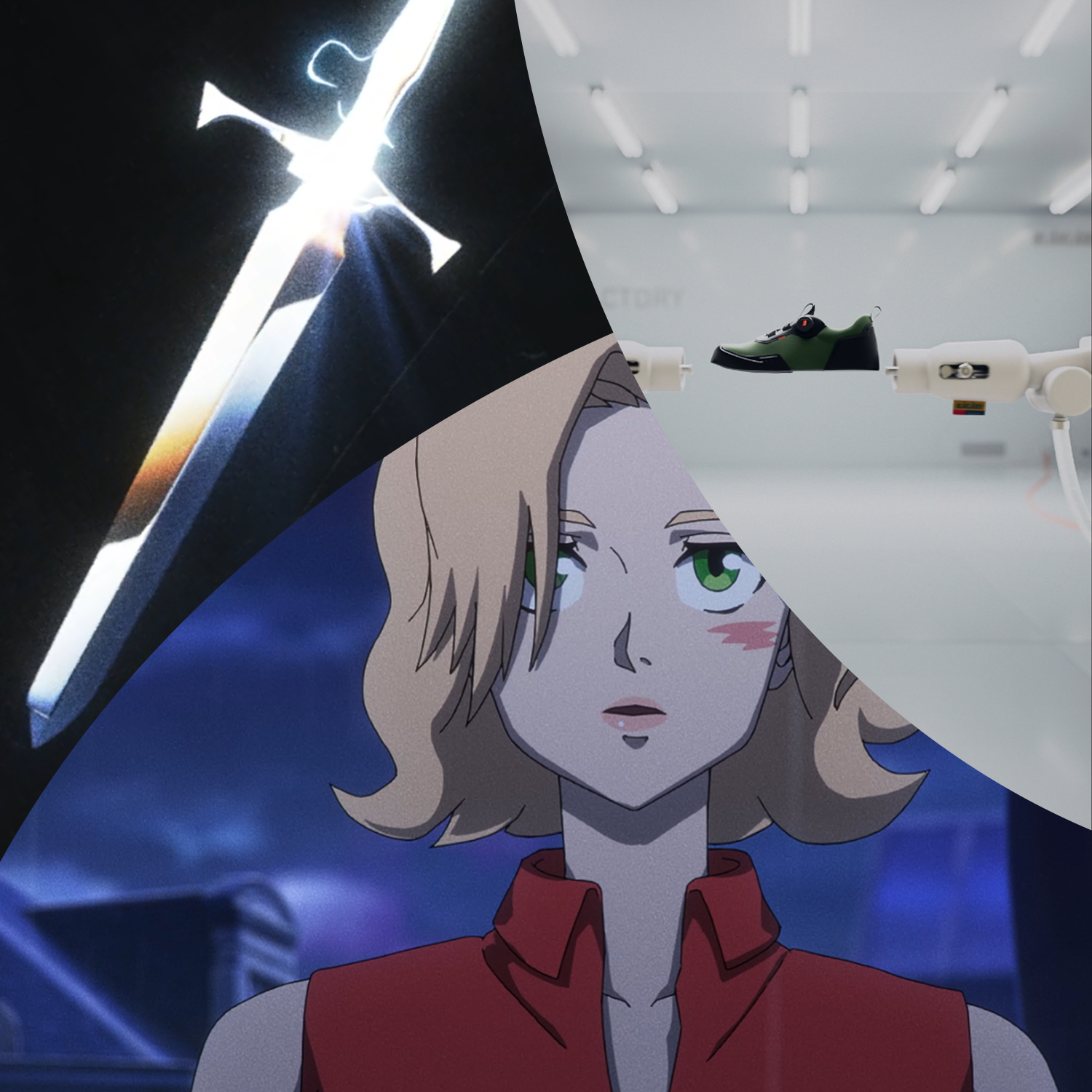
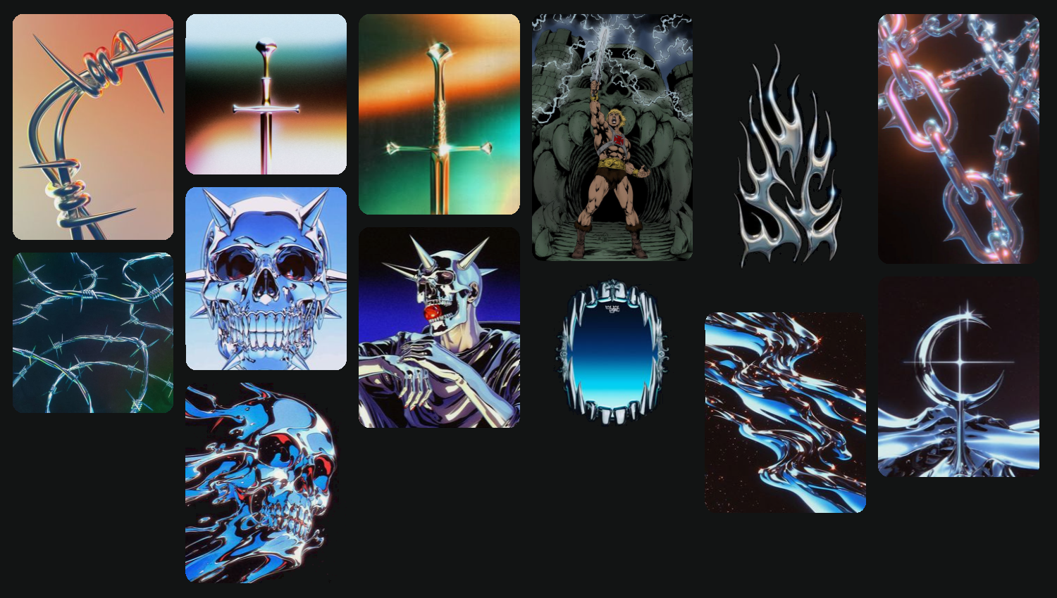
We received a clear brief from the very beginning. The Sweden Rock team came well prepared, with reference images, color ideas, and thoughts on the overall tone they wanted to capture. The first visual world they shared gleamed in chrome and drew inspiration from the classic comic magazine Heavy Metal – a perfect starting point. It set the tone for a style that was both nostalgic and raw, yet playful and new.
From there, we started experimenting. The visual direction quickly evolved into something that blended industrial grit with fun – a kind of retro VHS aesthetic where old anime met Guitar Hero and 80s fantasy. We tried out barbed wire, fire, and layered textures, all while keeping close communication with the Sweden Rock team to make sure everything stayed consistent and on brand.
After several rounds of development, we arrived at what would become the festival’s new symbol: a Heavy Metal-inspired sword, modeled in 3D but finished in a 2D style to preserve that hand-drawn comic feel. It became the centerpiece of the new visual identity.
Finding the right tone
Since the new graphics and logo needed to work across so many different formats – on the web, in social media, on stage screens, and in print – technical precision and attention to detail were key. Every element had to function both as part of the whole and as a standalone piece. We spent a lot of time adjusting light, contrast, and textures to make sure the visuals held up in every medium.
Much of the process was about finding the balance between the grand and the precise. A logo that fills a stage banner also needs to look right on a wristband. That meant working at extremely high resolutions – sometimes up to 20K – to make sure every surface and every highlight felt intentional and sharp.
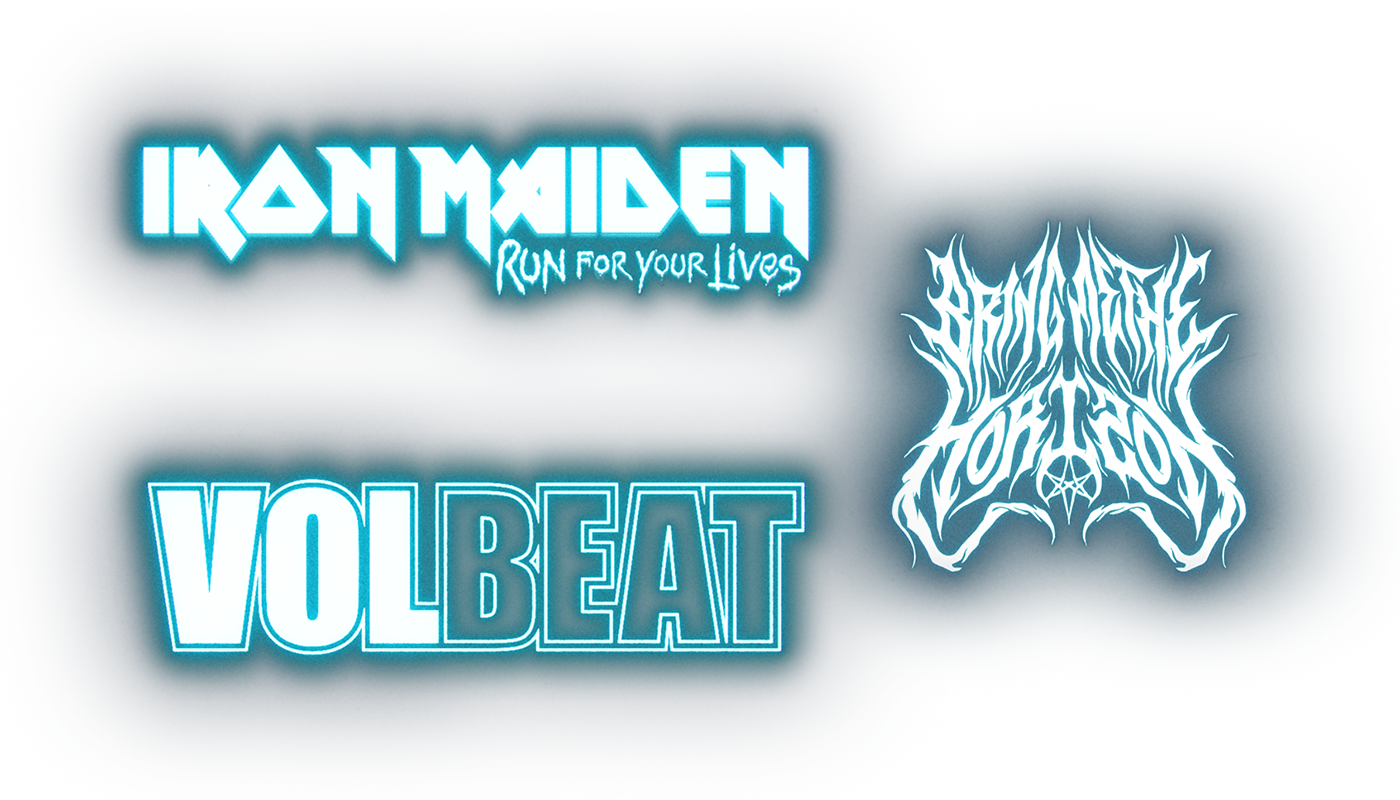
Band presentations
Another important part of the project was the band presentations – a central piece of Sweden Rock’s communication. Each band has a distinct visual style, so we needed a way to bring them together within the new design system. We decided to make all the band logos monochrome with a subtle glow effect, creating a cohesive look where each band could still stand out, but within a unified framework.
Print and Social media
What made this project especially rewarding was how well the collaboration worked. From the first meeting, we shared a common understanding of what we wanted to achieve. Sweden Rock had a strong vision, and we were given the freedom to explore and interpret it. That combination made the creative process flow naturally, without unnecessary detours or compromises.
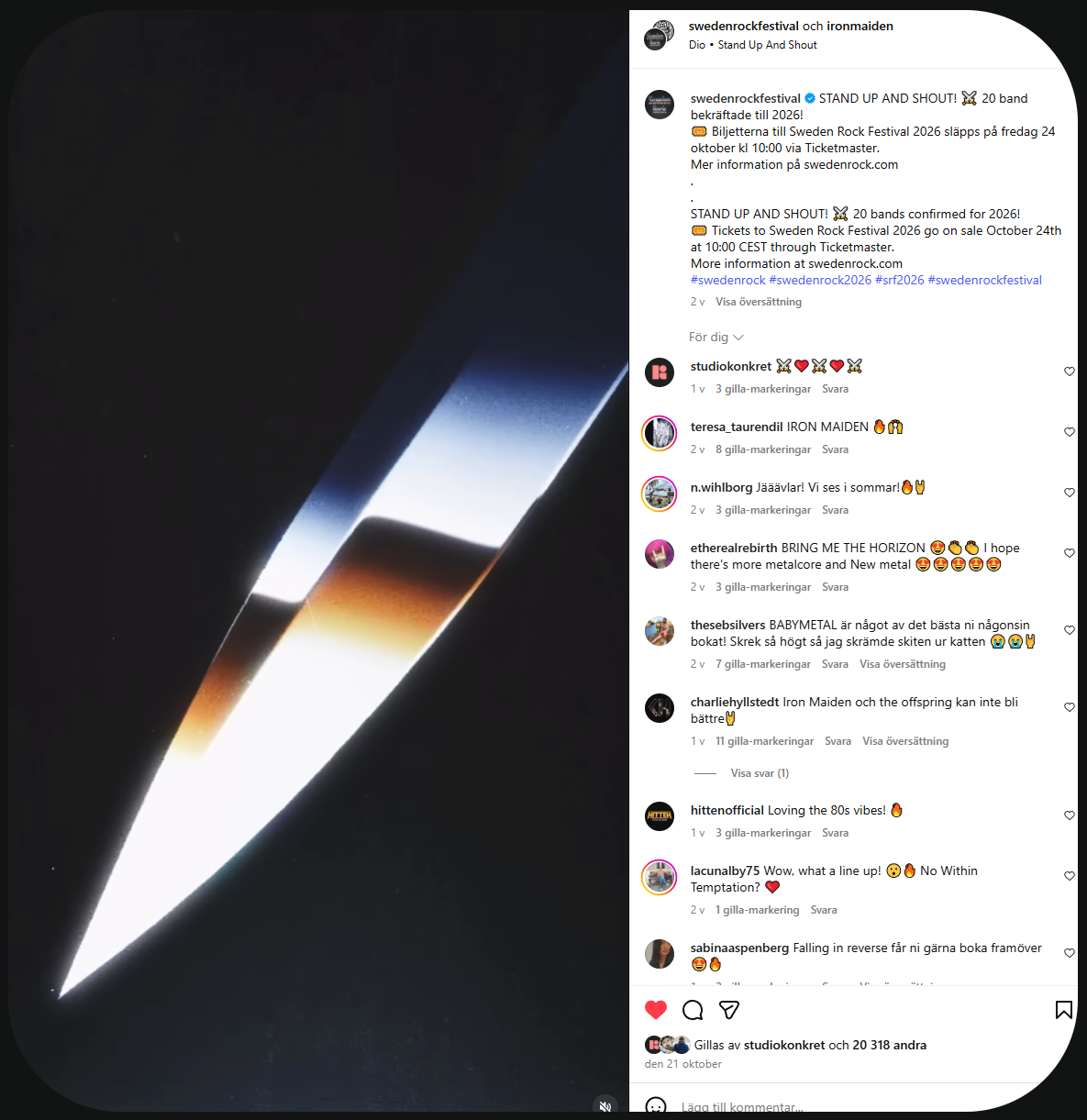
When the band release was posted and the new logo started appearing on social media, we immediately felt that everything had landed right. There was a sense of power and authenticity in the design – something familiar, but refreshed.

Result
Working with Sweden Rock Festival was a real highlight for us. It’s not often you get to help shape the identity of a brand that means so much to so many people – and where tradition and renewal can coexist so naturally.
We’re incredibly proud of the result, and grateful for the trust placed in us.
It became a project that perfectly captures what we at Studio Konkret love the most: when design, concept, and craft come together to create something that feels alive and true.
Kontakta oss
Välkommen att kontakta oss för offertförfrågan eller bara bolla idéer. Hör av er till Linus@studio-konkret.se


.png)